

Hyperlab UI & visual design
Hyperlab is A sports technology company based in Gandhinagar, Gujarat. Founded in 2021, we are rapidly revolutionizing the athletic training world with our flagship marvel, Helios. This laser equipped interactive training companion transforms any space into a data-driven, personal performance lab.
Collaborators
Industry Mentor: Studio Carbon, Client: Hyperlab
My Role
To elevate the visual appeal of the Hyperlab app, providing athletes with a visually engaging and immersive experience.


Learn, Unlearn, Relearn
The Learn, Unlearn, Relearn theory isn't just about acquiring new skills or knowledge. It's about developing a growth mindset – a belief that our abilities and intelligence can be developed through dedication and hard work. With a growth mindset, we are more likely to embrace challenges, persist in the face of setbacks, and ultimately achieve our goals.
Non-Disclosure Agreement
Due to NDA, I cannot share the details of the project but here are some quick learnings and snippets from the progress I made in developing the UI design for this brand.


I was responsible for understanding and translating the current brand language a new User Interface for the mobile application of the brand.
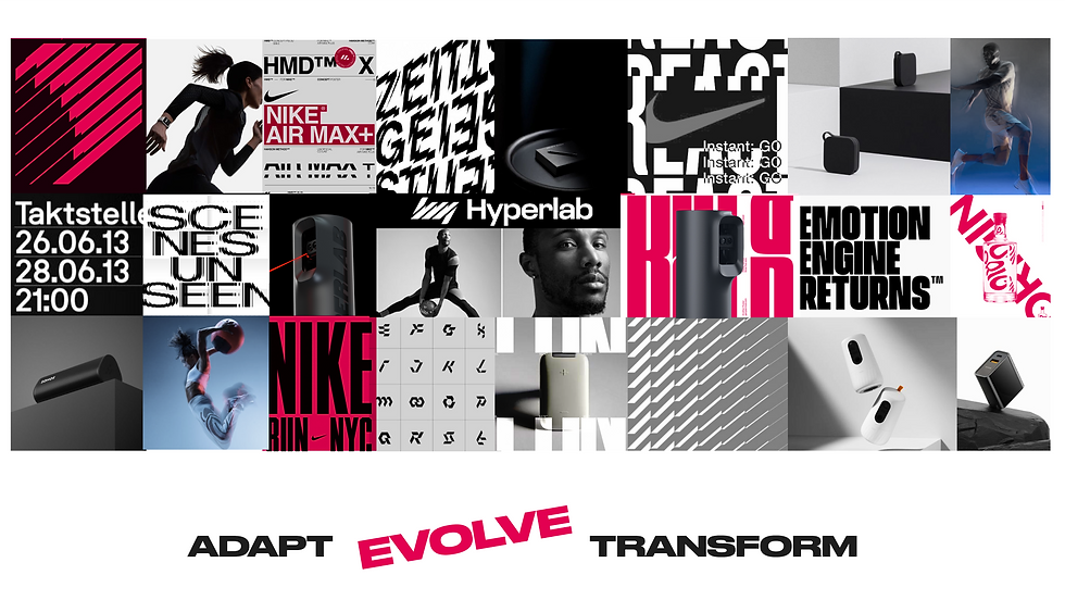


Product Benchmarking
Product benchmarking was done of the pioneers of tech and sports fields, the exercise was basically to understand how the company is portraying it’s brand values through different visual design elements like typography, color, imagery, textures, iconography and merging these elements in different forms to get a harmonious brand output in the end.

Adidas
Structured & aware
Clean and Modern - Use of Minimalist imagery and,Subdued Colors, Minimalist Interface, Sleek Typography
Quiet and confident
Tap gestures are used in most of the screen & hold feature to unlock the focus mode
Bold Sans-serif for headings, muted grey colour for body text.

Nike
Flow and wild
Dynamic and Energetic- images and play of fonts
Bold Typography- creates strong impact
Vibrant Colors
Loud - Bulky fonts and athletes in action, dynamic poses
Impactful - emotional connect via imagery
Motivating- use of quotes

Apple
Trustworthy
Playful- modern graphics, evolving design, vibrant colors
Clean and elegant- San Francisco font
Premium- High quality images, dynamic animations, Black & white color
High-end - Promising copy,
Experimental- breaks the grid,
Visual Direction 1


Minimal, Clean,
Focused, Professional
This visual direction encapsulates Hyperlab's new brand identity within a harmoniously minimal and sleek interface. The essence of minimalism is eloquently conveyed through the strategic utilization of black and white tones, underscoring sophistication and simplicity.


Visual Direction 2


Futuristic, Techy, Playful, Professional
Hyperlab is depicted as futuristic and technology-driven, harnessing cutting-edge training to unlock users' full potential. The app empowers users to customize their home screen to align with their priorities.
With a blend of playful and professional elements, navigating the app is both intuitive and enjoyable, offering seamless access to engaging drills and exercises.


